
Latest CMS pharmacy survey shaves $17.9 million off of Medicaid generic drug costs
Each week CMS posts updates to its National Average Drug Acquisition Price (NADAC) database. It quietly happens each Tuesday, without much fanfare. If you check this weekly, you likely have noticed that most weeks, not much changes. Maybe there were a few calls into the CMS help desk that triggered a price update, or a random wholesale acquisition cost (WAC) update on a brand name drug. But there is one week each month (normally either the 3rd or 4th week) where there is a lot of pricing action, almost exclusively within generic drugs. We call this “survey results week,” the week when CMS publishes changes to thousands of NDCs based on the survey results from prior month invoice costs reported by pharmacies all across the country.
This week is survey results week! While some people anxiously wait for Christmas morning to open presents, we anxiously wait for survey results week to analyze generic drug price changes. The good news for all of us is that CMS already has a fantastic tool to start poking around in the data. It’s called the NADAC Comparison Database. Just click on any week and all price updates come up (by NDC). Then just sort on the Percent Change field and you’ll see all of the big movers in the latest month’s survey. And there are some big movers! We’ve been hearing from pharmacies over the last month about the precipitous drop in the price of Generic Viagra (sildenafil), and yesterday that was reflected (and then some) in its NADAC, at least for the 25MG strength, which cratered from $27 per tablet to just $0.56 per tablet. We have updated our 46brooklyn Drug Pricing Dashboard with the latest NADAC prices (also embedded below), which paints a nice picture of what a 98% drop looks like in one month , especially compared to brand-name Viagra which will still run your pharmacy $65 per tablet.

But then go back to CMS’ NADAC Comparison tool and sort Price Change by “Descending.” You’ll find thousands of generic NDCs that went up in price. Number one on the list this week is generic Ziac (bisoprolol-hydrochlorothiazide) 5-6.25MG, which increased by 385% versus the last survey price. Yikes! Overall, there were 351 NDCs whose price increased by 25% or more in this last survey.
As helpful as CMS’ tool is, the issue that arises is that one cannot make sense of all of the prices that are moving around from month to month. Like us, you may just want to know, was this update good or bad? Did aggregate generic prices go up or down?
This is what motivated us to create our latest dashboard, which given that we lack creativity we are calling NADAC Change Packed Bubble Chart (which is, technically, exactly what it is). We’ve embedded this below, and you can also access it through our Visualizations page.
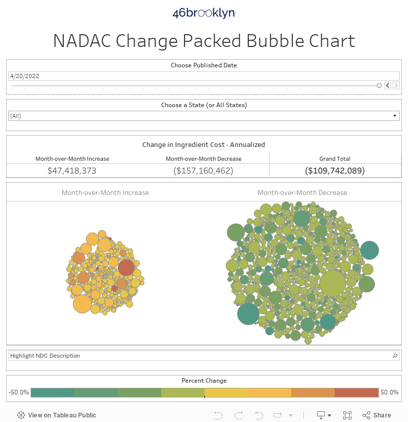
The goal with this visualization is to put some context around the latest NADAC survey results. It’s important to know which drugs went up and down, but we need to add a weighting to the drugs to see how meaningful the change is. Clearly a 300% change in drug that is rarely dispensed is much less impactful than a 25% change in the highest volume generic in Medicaid. To add this context, we merged the NADAC Change Database together with the Q1 2018 State Utilization Database. By bringing these databases together, we were able to add one very important field to CMS’ NADAC change database – how many units were actually dispensed in Medicaid in the most recent quarter. With this new enhanced database, we are able to get closer to an answer to the question on if this latest price update was good or bad on a net level.
It turns out this last price update was a good one, at least based on Medicaid’s drug mix. Using Q1 2018 volume as our baseline, the latest NADAC changes reduced generic ingredient cost by just under $4.5 million, or on an annualized basis, $17.9 million. Please note that this number isn’t the full picture, as we only include oral solids (to avoid unit mismatches) but we are still covering over 80% of all records.
One thing this dashboard will make clear is that there is a lot going on underneath this $17.9 million decrease! The packed bubble chart shows that there are hundreds of drugs that increased in price, and hundreds of the drugs that decreased in price, that all netted out to a decrease on Medicaid’s mix. The size of the bubble represents the absolute increase/decrease in cost to Medicaid, while the color represents the percent change versus the last survey. Select any state to see what the impact was using that state’s Medicaid drug mix.
With drug prices being such a hot topic nowadays, we find it interesting that so few people are paying attention to arguably the best free, public database available on drug prices. As of the time of writing, the NADAC Comparison as of 8-22 database has been out for at least 24 hours, and there have been 17 total views (and we are probably over half of them).
We need to do a better job celebrating “survey results week,” at the very least to support the investment that is being made by CMS to improve drug price transparency. Hopefully our new dashboard will better contextualize the myriad changes from month to month, and bring more attention to this vital source of drug pricing data.