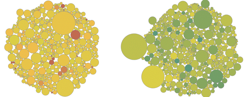
It’s NADAC survey results week, which means it’s time for our fifth installment of “what happened to generic drug prices last month.” On a positive note, it looks like there was a bit of net deflation. But overall it was a less than stellar month for generic deflation - it was the first month (since we started this monthly review) where we saw more generic drug price increases then decreases. As always, the details matter, and we’re here to provide them for you. Check out our latest drug pricing report for a lot of important updates, plus an updated NADAC Packed Bubble Chart!
Read MoreAs drug pricing scrutiny grows, PBM spread pricing of cheap, generic drugs is becoming a hot topic of conversation in states across the country. After the state of Ohio opened the books thanks to an audit from the state auditor, the uncovered $224 million PBM spread now has other states scrambling to see what they are being charged as well. One of those states is Pennsylvania, where their state auditor is trying hard to get the data he needs to see where the money is going in the third largest managed care program in the country. Since there are many folks wondering what’s going on in Pennsylvania, considering the current lack of hard data, we decided to dig into the publicly available data to see if Pennsylvania appears to have the makings of an “Ohio problem.”
Read MoreCMS published their latest National Average Drug Acquisition Cost (NADAC) survey results today, and they've given us a lot to be thankful for! Applying the latest pricing changes to Medicaid's 2018 drug utilization mix results in $169 million of annualized savings on generic drugs. Moreover, we got both better "quantity" and "quality" out of this update. In other words, more generic drugs went down in price (quantity) and of the ones that went down, a lot more went down by a meaningful amount (quality).
Read MoreAverage Wholesale Price (AWP) is a meaningless benchmark price for generic drugs, but despite its lack of substance, AWP-based payment models just won't go away. Unfortunately the contractual reliance on a benchmark that has no relevance to actual price makes it very difficult for the payer to know if they are getting a good deal or not. They are left to pay a fixed discount off of an unknown combination of meaningless, non-market-based, numbers. Seems like that would be tough sell, but this is drug pricing we are talking about, so of course, it's the norm. For the past couple months, we compiled data to create a visualization to help illustrate the problem that arises by anchoring generic drug costs to AWP. The finished product is embedded in this latest report "Inside AWP: The Arbitrary Pricing Benchmark Used to Pay for Prescription Drugs," along with our observations and analysis.
Read MoreOn October 24, 2018, CMS released an update to all State Utilization Data posted on data.medicaid.gov. Most notably, the 2018 database was rolled forward to include Q2 2018 data. As such, we have released updates to all 46brooklyn dashboards posted on our visualizations page. In conjunction with this update, we have also published a new dashboard that allows the user to identify the top 20 drugs in each state’s managed care (MCO) program that have a markup (MCO paid amount less NADAC ingredient cost) of over $20 per prescription.
Read MoreIt’s NADAC survey results week, which means it’s time for our third installment of “what happened to generic drug prices last month.” It looks like there was a bit of net deflation, but overall, there were an equal number of price increases and decreases. But as always, the details matter. Check out our latest drug pricing report for a lot of important updates, plus an updated NADAC Packed Bubble Chart!
Read MoreAfter Bloomberg put drug price markups on the map, we decided a deeper dive into markups was warranted to see which drugs were getting overinflated and which drugs were not. To sort things out, we built a new visualization dashboard to compare drug markups between state Medicaid programs. We call our creation the “Medicaid Markup Universe.” In this new visualization tool, we found a disturbingly large difference in drug markups across generic drugs in state Medicaid managed care programs, resulting in a slew of warped incentives that pressure supply chain members to value certain medications over others, and thus, certain patients over others. Check out our newest visualization tool and read our latest drug pricing report.
It’s NADAC survey results week, which means it’s time for our second installment of “what happened to generic drug prices last month.” Good news. Prices are dropping significantly. Check out our latest drug pricing report for lots of important updates, plus an updated NADAC Packed Bubble Chart!
Read MoreEarlier this week, Bloomberg reporters Robert Langreth, David Ingold, and Jackie Gu published their results of a fascinating deep dive into Medicaid generic drug prices in their article, “The Secret Drug Pricing System Middlemen Use to Rake in Millions.” The piece did an excellent job explaining the ins and outs of the hidden pricing spreads that exist on generic drugs, and it featured some intuitive visualizations that helped educate readers who may not have been familiar with these little-known drug price tactics. Bloomberg’s methodology was nearly identical to what we used to create our Medicaid Drug Pricing Heat Map, so not surprisingly, the results were very similar as well. The analysis conducted by Bloomberg also integrated the results of a recent report from the state of Ohio's Auditor, which found that in a one-year span, PBMs pocketed more than $224 million dollars in spread pricing. Armed with this data, we set out to discover if we could deduce what pharmacy margins were over that same time period in an effort to peel back new layers of the onion and provide better information on where the money is going. Check out our newest drug pricing report to learn more about where the money is going on hidden prescription drug markups.
Read More


